Matt Sexton & Abby Anstead, Sports Editor & Managing Editor
March 24, 2016
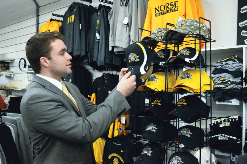
Matt Sexton NKU student Will Weber started a petition asking the university to reconsider the decision to change the athletics logo. Students have complained the new logo isn’t as attractive as the old logo, pictured on the hat.
A change to the NKU Norse logo, a part of a brand standards change in the athletics department, has caused more online buzz than any athletic contest this school year.
The change was announced March 16 by Bryan McEldowney, assistant athletic director at NKU. The new logo has been met with an Internet backlash from students not pleased with the updated look.
Kelly Martin, assistant vice president for marketing and communications, said the goal of the change was to create one logo that represented NKU athletics.
“We started with 17 logos in athletics,” Martin said. “Although we had 17 logos, and we knew we would like to get to one, the one that we ended up with was, in theory, the primary athletics mark already. But it wasn’t treated that way.”
Martin said a trip to the college bookstore showed the variety of logos being used to represent Norse athletics.
“A great visual a year ago would have been the hat wall in the bookstore,” Martin said. “If you looked at that wall of hats, it was like logo soup on the wall. If six people walk by you on the street, and they all have a different NKU logo on, you don’t realize that you saw six people from NKU.”
Even when the old logo was used, Martin said there was a multitude of variations that came across her desk for approval.
“The one logo with four colors was often printed in just one color or in two or three, and variations within,” Martin said. “So it was already in this original state being altered frequently. I see all of the licensing requests for retail come through me for final approval. It’s almost daily that it would be a variety of not only of logos but how the primary logo was represented.”
One of the first things to go in the new logo was color gray on the helmet of the old logo, which McEldowney said is not a primary color for NKU athletics.
NKU Athletics The new NKU logo (right) was implemented by the University March 16, replacing the old logo (left).
This was just one of the complicating factors with the old logo, Martin said.
“Gray was not a primary color for NKU which created confusion,” Martin said. “The four-color mark is hard to reproduce consistently and at a low cost. Most of the time you screen print with two, maybe three colors. The intricate notches of the mark when you embroider in a small location – you lose that anyway.”
The unveiling of the new logo was met with strong reactions from students.
Will Weber said that he, his running mate Ellen Wilshire and campaign manager Patrick Reagan created the #BringBackOurLogo petition after he heard negative feedback about the new athletics logo at a women’s basketball game.
“One of the things that I felt was the most important to create the petition was that the student voice needed to be heard,” Weber said. “Administration and athletics and everybody needed to notice the student voice. It was more important to unify that voice in a petition than just kind of whispers between friends.”
The petition was made public on March 20 and has received over 450 signatures in 48 hours.
Weber said he would like to work with the administration to communicate to students why the changes to the logo were made.
“They had great reasons for changing it, but when you’re a student you don’t really get to see all of the ‘whys’ or all of the stuff in the background,” Weber said. “When you don’t have that, you do kind of say, ‘Hey, why are you messing with our logo?’”
Martin and McEldowney both were excited to see the passion from the students on the issue, even if some of the feedback was negative.
“I love – well, love/hate – seeing a petition like that,” Martin said. “You want people to be happy and excited about what you’re doing. But I loved the passion that I was seeing. I have to admit that I’d love to see that passion evolve into attendance at games and proactive feedback. There are more people that responded to the petition than responded to the survey.”
The survey was conducted in the fall and had more than 60 questions. Martin said there were questions on the survey ranging from the satisfaction with the greeters in the area to the brand identity.
Those who responded to the survey made some things very clear to Martin.
“We knew right off the bat – don’t mess with the color, don’t mess with the Norse,” Martin said. “There were very loud and clear voices about not adding expense to the university.”
There was discussion during the process for a complete overhaul of the NKU athletics logo.
“We did consider some logo concepts that were completely different,” Martin said. “And again, listening to the research, the loudest voice was ‘Do not add expense to the university.’ We knew that was not even an option.”
Olivia Adkins, a junior social work major, believes that students should be more concerned with the fact that the new logo will be saving money.
“I think that cutting the cost by changing something so small and trivial will benefit the students in the long run, so people shouldn’t be seeing it as this huge, detrimental issue,” Adkins said.
In terms of the new logo design, Adkins thinks the changes are not major enough to be concerned about.
“I’m an art minor, so I understand, I want things to visually look good too,” Adkins said. “I have no problem with people wanting things to look good, but honestly the details were really small so I think there is a lot of conversation that really doesn’t need to be had.”
McEldowney has seen this type of backlash before – as a fan of the University of Dayton Flyers.
“I was a University of Dayton fan, and a couple of years ago they made their logo change,” McEldowney said. “It was met with a ton of resistance. My Facebook feed was just littered with all of my friends and former students – how they hated it. I haven’t heard a single thing about it since two or three weeks after they first did it – from any of them. I’ve got friends that still work there.
“When people are passionate, there’s always that element of passion that’s great to have. Quite frankly, I’m excited to see it.”
McEldowney said when the new adidas contract takes effect July 1, all of the new uniforms will include the new logo. He said the old logo will be phased out over the next three to five years, as objects bearing the old logo are replaced as they wear out.
Mary Andrikus, sophomore economics and Spanish major, didn’t want to be too harsh about the new logo, but wasn’t a fan of the new cleaner look. After thinking about it, she summed up her feelings..
“The new look is … it’s really ugly,” Andrikus said with a laugh. “I hesitated with using ugly.”
Donate to The Northerner
$1500
$2500
Contributed
Our Goal
Your donation will support the student journalists of Northern Kentucky University. Your contribution will allow us to purchase equipment and cover our annual website hosting costs.