Spanning two gallery spaces and a wide range of mediums from photography to font-making, SOTA’s annual juried student exhibition—running from March 16-31, features the best of what NKU’s fine arts program has to offer, as determined by juror Sylvia Rombis, president of Cincinnati’s Malton Art Gallery.
To someone ambling through the Fine Arts Center’s third floor hallways, the exhibition could appear chaotically arranged. Sculptures mounted on plinths jut from the floor, like small road signs between framed work exposed by main walls or sectioned off into hidden pockets of the gallery. A standing mirror draped by an apron emblazoned with a playing card design invites onlookers to try the article on for size.
You have to step inside to understand how the individual pieces fit together. Portraits of young men reclining—painted with oil on canvas—gather in a cozy nook. Pieces that prominently feature skulls are featured in another. Posters featuring student-designed fonts act as eye-candy for typeface enthusiasts.
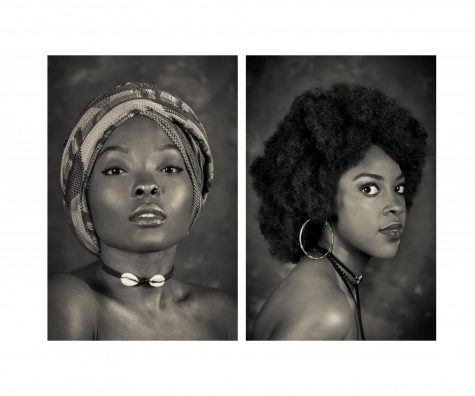
Waiting by the doorway are a pair of grayscale portraits taken by senior Mesa Serikali. The two prints comprise her “Neo Black Cameo”diptych, a modern answer to Coreen Simpson’s “Black Cameo” series of jewelry designs, produced in the early ‘90s.
“Last year, I had an assignment to choose a contemporary photographer and get inspiration from them—not imitate their style but emulate it,” she said. “I chose [her] because I was trying to choose black women photographers, because that’s more relatable to me and I’d never really seen any.”
Mesa Serikali Serikali’s “Neo Black Cameo” diptych is a modern tribute to Coreen Simpson’s work.
This prompted Serikali to search for inspiration online, which led her to Simpson’s work. One piece in particular stood out: Simpson’s take on the traditional cameo: a silhouette profile carved in relief on an oval background.
“I kind of wanted to emulate that with current faces—current ideas of beauty,” Serikali said. “Piercings, necklaces, black features. But I also wanted to make it old-timey, so I went with a black and cream instead of a black and white. It’s more sepia.”
Serikali said she first became interested in photography about 10 years ago: it started with a Panasonic camera, covered in plastic jewels and the stickers that came with her Nintendo DS. Later, she upgraded to a pink Kodak.
“I was always taking pictures,” she said. “I was in love with everything around me, taking pictures of like, grass, my hair; stuff in my mom’s backyard. Stuff like that.”
Serikali and her mother made a bet that if she tested into duPont Manual, a Louisville magnet high school, her mom would buy her a DSLR (digital single-lens reflex) camera in order to help her continue to improve.
After passing the entrance exams (and receiving the camera), she joined the staff of Manual’s newspaper—the Redeye—and rose to become photography editor, where she was able to get snaps of an impressive list of subjects, from Reggie Watts to president Barack Obama on the 2012 campaign trail.
Now, in addition to her artistic work, Serikali makes a living taking portraits and does freelance work for Cincinnati CityBeat.
In the near future, she’d like to create a visual companion to Frank Ocean’s 2016 album Blonde, track by track.
“He’s a huge inspiration for me,” she said. “I’ve listened to Blonde so many times, and I’ve envisioned what project or what scenes he talks about, like his Acura car. I want to find an Acura and do a project with it. But, I have a Pontiac, so maybe I could do something with that.”
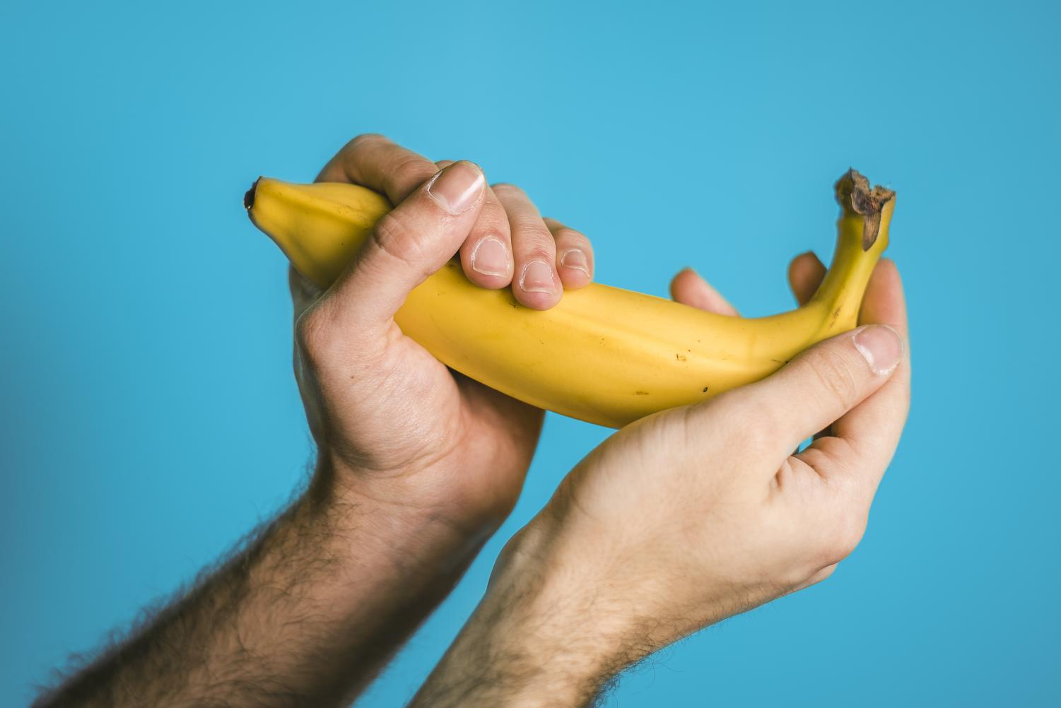
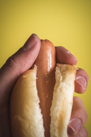
While Serikali’s work is subdued and monochrome, senior Scott Sanker’s work is anything but. Hearkening back to the Pop Art age, the bold snapshots in his “Objectify Me”series put phallic food front and center, foregrounding solid, bright colors.
Scott Sanker A hot dog ordered from Skyline Chili is the subject of this piece from Scott Sanker’s “Objectify Me”
A hot dog purchased from the Skyline Chili drive-thru is cradled in front of a mustard-yellow backdrop. The orange tip of a bottle of Elmer’s glue leaks its contents. A cucumber is used to an effect that, by now, you can probably imagine.
“Coming from the LGBTQ community,” Sanker said, “more specifically the gay community, I was thinking about my own sexuality and identity—how sometimes, it can be hypersexual, and simple things can be perceived that way. It’s an exploration of my experience in the community so far.”
He chose food because it’s a universal symbol: something one interacts with on an everyday basis. Even though there’s nothing overtly sexual about the photos, he said, one can’t help but find them suggestive.
Sanker’s forte is studio and advertising work. Conceptually, “Objectify Me” is a departure from his usual work, but the series’ eye-catching minimalism is not. His work is meant to mimic the design of a print advertising, citing the aphorism “sex sells” as an inspiration.
“I like playful stuff,” he said. “I usually like happier or funnier pieces. I’m not too complicated of a guy.”
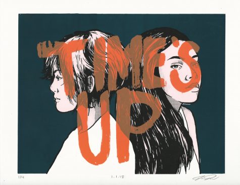
Fellow graphic design student Jenna Turner has an impressively diverse range of offerings at the exhibition. You’ll find her name next to a screenprint, a tote bag, and a typeface called “Black Lace.”
Thick and brash, yet elegant, “Black Lace” is a modern update to traditional European “Black Letter” typeface: the sort of blocky, gothic print that would have been used in an early printing press.
“I studied traditional Black Letter forms and noted the error in their readability,” she said. “I wanted to simplify a set that could theoretically be used in modern day.”
“‘Til Death” and “Time’s Up”—both screenprints—each feature comic-book inspired drawings of young women, paired with their title written at the top of the composition.
Jenna Turner “Time’s Up”
The former print’s lone subject looks offscreen, her chin propped up by two skeleton hands. In the latter, two women stand back-to-back, our view obscured by translucent text.
“Pop art imagery and old screen prints are always a huge inspiration for my work,” she said. “With the “Time’s Up” screen print, I wanted to create a responsive piece to what’s going on through the movement. There are so many strong girls out there using their voice to say enough is enough and I think this is super powerful.”
Awards for the best submission in each medium will be awarded at a reception in the Main Gallery and 3rd Floor Gallery on March 29 at 5 p.m. If you’re interested in purchasing student-created artwork, a book beside the Main Gallery’s entrance lists each piece and its corresponding price.
Donate to The Northerner
$1500
$2500
Contributed
Our Goal
Your donation will support the student journalists of Northern Kentucky University. Your contribution will allow us to purchase equipment and cover our annual website hosting costs.