
Five questions you might ask about NKU’s new website design
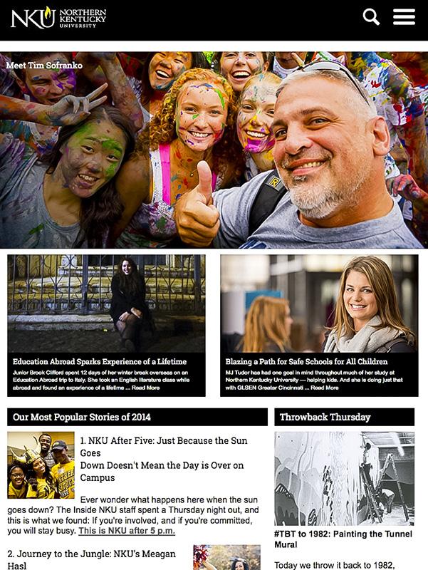
NKU’s website became responsive this month. The site’s design can be viewed on any device.
On January 15 nku.edu switched over to a responsive website design. This switch has caused some confusion among the NKU community, so The Northerner set out to find the answers to students’ questions.
1. Why did NKU switch to a responsive website design?
According to Jim Nilson, director of Digital Marketing and Communications, NKU’s mobile traffic has increased in the last few years.
“Thirty percent of people, when they hit the site, it’s pinching and pulling, and it’s not responsive, so probably a lot of that traffic’s frustrated, so they probably didn’t continue on past whatever page they were on,” he said. “I expect our numbers to go up even more, so we’ll definitely see an increase in our mobile traffic, but then [with] them kind of navigating the site, less frustrations.”
Nilson said having a responsive site will reflect the direction NKU is heading with technological advances.
“Here at NKU we’re talking about how we’re up-close and personal, or innovative with the College of Informatics, things like that,” Nilson said. “We should be that on the web, we should kind of have that cutting edge and provide that path to get people where they want to go.”
- What is a responsive design?
NKU’s Information Technology website outlined the project as “enhancing the website to accommodate rendering appropriately on various sized devices (PC, smartphone, tablet).” Simply put, NKU made a change in the website’s coding that altered its design to fit any screen size.
“You have one site and it’s going to respond according to your device-it doesn’t matter what your device is,” Nilson said. “On a desktop, you don’t even realize that it’s changed.”
Thomas Barker, IT Technical Architect, said that in order for the site to fit on a mobile screen, it had to be redesigned.
“That increasingly means that you have to deliver content that looks good on those platforms,” he said.
Barker added that the same designer that worked on NKU’s new mobile app drew up the design for NKU’s mobile template, saying, “she already had kind of a really good feel…for what would work on a small platform and so she used that expertise to build out the smartphone…and the tablet size.”
- How long has this project been happening?
Nilson said the project has been a personal goal for five years.
“In 2009 we started kicking around the idea, and probably in 2010 we started looking at the trends and we started seeing responsive become more and more popular,” he said. “About two years ago is when we made the decision to go responsive.”
According to Nilson, Marketing and Communications had just redesigned the website and could not rework it. He said the department had to find a way to alter the website’s new template to make it responsive.
“Probably over the last year we began to do hard-core development, looking through the styles on mobile devices,” he said.
- How long will this take?
Nilson said the project is in its last stage but still has a ways to go.
“Now we’re going to have to convert the other 200 to 250 sites over,” he said. “We’re going to be very aggressive…but we have to do it site by site, because we have to look at the content and make sure it looks good on all the devices.”
From an IT standpoint, Barker said there will be coding roadblocks to work through.
“As we move forward we’re going to encounter things that need to be fixed, things that need to be tweaked,” he said. “It’s a very large and a very complex site. There are some areas where the responsive template might not work as well as anticipated.”
- How will this benefit me?
“The advantages to a responsive website are all user-oriented,” Barker said.
Changing a website template to a responsive design increases its usability to visitors, agreed Nilson.
“We want to make sure we’re meeting the needs [of users],” Nilson said.
According to Nilson, having a responsive website will cut down on the frustrations users experienced in the past when visiting NKU’s website.
“When you get to the site and you’re having to pinch and pull and zoom in and zoom out, that’s frustrating,” he said. “Instead, make it responsive, have everything in there, make it easy for people to find the information they want. If you make it easy for them…there’s not going to be a problem.”